
MoveHub
Customer Relationship Management Application for a non-profit
CLIENT
Shelter Movers- national, volunteer-powered charitable organization that provides moving and storage services to women and children fleeing abuse.
ROLE
Lead UX Designer
RESPONSIBILITIES
UX/UI
Prototyping
Information Architecture
Project Brief
Design a customer relationship management application that will assist in facilitating, coordinating, planning, and executing a move within the organization.
Context/ Process
Each client is served by a team of volunteers consisting of a
intake coordinator
move coordinator
driver
few additional movers
This requires a lot of coordination, planning, and communication.
To ease the overall moving process, the organization decided to create a digital application that will make it easier to facilitate the different components.
Process
Discover —> Define —> Develop —> Deliver
Problem
The need for a digital solution that will enable the teams to coordinate, plan and conduct moves.
Solution
Be able to conduct intakes for new cases in one place seamlessly.
Ability to conduct moves from start to finish through the application.
Users
User Group
Intake Coordinator
Intake Coordinator Supervisor
System Administrator
Move Coordinator
Move coordinator Supervisor
System Administrator

Research
Re-examine the Information Architecture and the existing functionality of the application. Subsequently, re-design UI elements.

I proceeded to analyze user feedback & map out the information architecture of the existing app and began flagging any flaws within the user flow.


Design
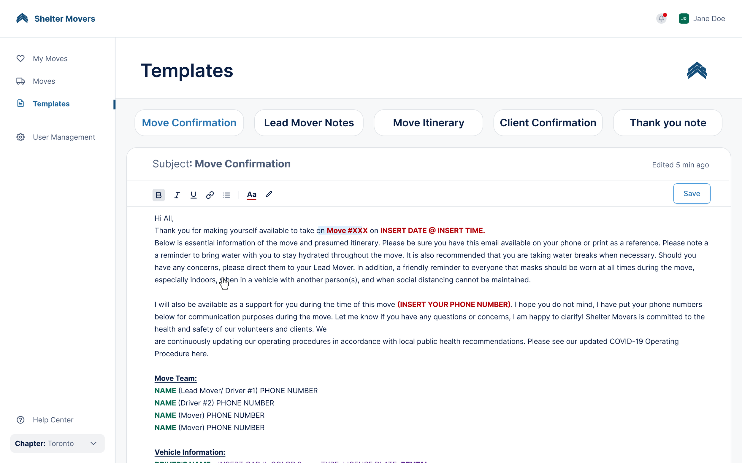
🎯 The purpose of this page is for movers to be able to edit and save templates for each move they complete.
I re-examined the entire functionality of the page.
🔑 One of the key insights we learned from user feedback was that there was an
overload of information in the app and
it was difficult for users to figure out how to navigate from start to finish.
💡 Changes made:
Removed the archive section of templates because there is no need for the primary users to access previous templates.
So instead- I proposed a simple solution where the user can edit their templates and save them within the browser. Reduced the number of clicks that the user must complete
The goal is also achieved: the user can edit and save each template.
Another section of the app that went through re-design is the primary page that hosts all the steps the movers must complete. The majority of the design changes were made here.
1️⃣ The first is to visually relay the user flow in chronological order. This way the user can follow the tabs one by one and it will lead them through all the necessary processes of a move
2️⃣ The second reason is to lay all the necessary information on one page rather than dispersing them through multiple pages or creating sub-pages which is what the old design did.
Another feature that was missing altogether was a status bar.
Because of this, there was no way for the user to know what status a move is currently in.
This was a huge design flaw because, in order to conduct a move, there are multiple reviews that need to be sent and approved.
If the user cannot see which stage of the move they are in, it can lead to a lot of miscommunication and frustration.
💡 To solve this, I added a status bar at the top that clearly shows which stage the move is in.
A challenge I faced while designing these pages is that depending on the stage a move is in certain buttons must be enabled or disabled dependently.
This is where mapping out the processes in my research phase was useful.




Reflection
Key takeaways
1️⃣ Systems thinking & design thinking
Systems thinking is a more holistic approach to analysis that considers multiple factors.
Systems thinking also facilitates a shift in mindset, away from linear thinking to circular thinking.
2️⃣ Impact
The application will be used by hundreds of volunteers nationwide.
The application will be used in over 11 cities across Canada, by 2500+ volunteers and will serve over 150+ clients every month.
The app will directly increase the capacity of how many moves will be completed which will ultimately help more people.
This project really put into perspective the importance of design and was very inspiring for me as a designer.