MoveHub — CRM for
Shelter Movers
Designed a customer relationship management application to assist in facilitating, coordinating, planning, and executing moves within Shelter Movers — a national, volunteer-powered charitable organization providing moving services to women and children fleeing abuse.
The challenge
Design a digital application that will enable volunteer teams to coordinate, plan, and conduct moves from start to finish. Each client is served by a team of volunteers — intake coordinators, move coordinators, drivers, and movers — requiring significant coordination, planning, and communication.
"The need for a digital solution that would enable teams to coordinate, plan, and conduct moves — in one place, seamlessly."
Who uses MoveHub
Intake Coordinator
Opens new cases and manages the initial intake process for each client
Intake Coordinator Supervisor
Reviews and approves intake cases before they move forward
Move Coordinator
Plans and coordinates each move — volunteers, logistics, timelines
Move Coordinator Supervisor
Oversees move coordinators and approves moves at key milestones
System Administrator
Manages templates, permissions, and operational health of the platform
Drivers & Movers
Execute the move on the ground — need clear instructions and confirmed itineraries
Re-examining the existing system
I re-examined the information architecture and existing functionality of the application — analyzing user feedback, mapping the IA of the existing app, and flagging any flaws within the user flow.


There was an overload of information in the app, and it was difficult for users to navigate from start to finish. The existing design dispersed information across multiple sub-pages, with no clear linear structure matching how a move actually progresses.
What I changed and why
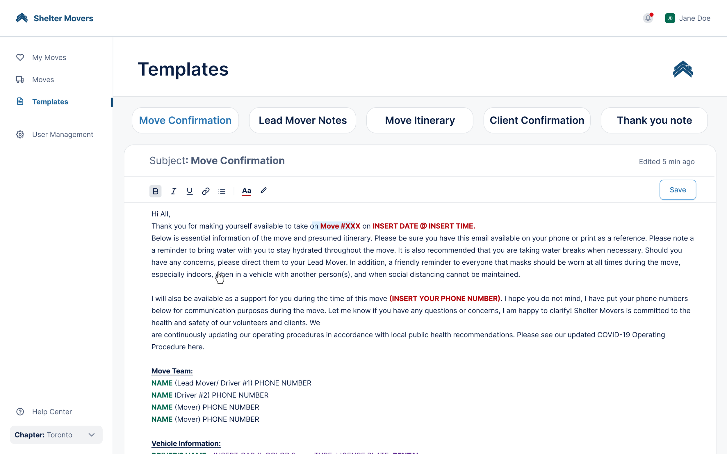
Removed the archive section — primary users had no need for it. Proposed a simple solution where users can edit and save templates within the browser. Fewer clicks, same goal achieved.
Re-structured the primary move page so tabs appear in the order a coordinator works through them — visually relaying the user flow in chronological order, laying all necessary information on one page.
Added a status bar at the top that clearly shows which stage the move is in. A critical missing feature — without it, there was no way for users to know the current status or which reviews were pending.
The redesigned application
The redesign was driven by two clear findings from user research: information overload, and no clear path through the app from start to finish. Every design decision traces back to one of those two problems.
Restructuring the move flow around how coordinators actually work
The primary moves page was the most complex surface in the application — and the one with the most friction. The original design scattered move steps across multiple sub-pages with no clear sequence, making it easy to miss critical steps or lose track of where a move stood.
The key insight was simple: coordinators move through a move chronologically. The redesign reflects that. Tabs were restructured to mirror the actual order of operations — so a coordinator can follow the flow from left to right and know exactly where they are at every stage.
The second major addition was a status bar. Without it, there was no way to know what stage a move was currently in — a critical gap given that each stage requires specific reviews and approvals before progressing. I also had to account for conditional logic: depending on the move stage, certain actions need to be enabled or disabled. Mapping this out during the research phase made those decisions traceable and defensible in the final designs.


Simplifying template management for administrators
The templates section existed to allow administrators to create and manage reusable templates for each move type. But the original design included an archive section that primary users had no practical need for — adding visual clutter and extra navigation without adding value.
The redesign stripped this back to what the user actually needs to do: edit a template and save it. Rather than requiring multiple steps across different pages, the updated flow lets administrators edit and save templates directly in the browser. The goal is identical — the path to get there is significantly shorter.


Key takeaways
Systems thinking & design thinking
Systems thinking is a holistic approach that considers multiple factors simultaneously. This project facilitated a shift away from linear thinking to circular thinking — understanding how each design decision affects every other part of the system.
Design with direct impact
The application is used by 2,500+ volunteers across 11+ cities in Canada, serving 150+ clients every month. Design decisions here directly increase the capacity for how many moves are completed — and ultimately help more people in need.
"This project put into perspective the importance of design — and was very inspiring for me as a designer."
Building for a charitable organization serving vulnerable people made every UX decision feel meaningful. The clarity, efficiency, and reliability of this app directly affects the organization's ability to help people at some of the most difficult moments of their lives.